Thursday 26 September 2013

Inception Trailer Analysis


Inception Trailer Link: http://www.youtube.com/watch?v=66TuSJo4dZM&safe=active

Throughout the trailer there are voiceovers used, but it is speech taken straight out of the film; which is evident because conventionally at the end of each voiceover the audience can see which character is speaking and this in itself provides more information about the characters’ roles and personalities. The protagonist, ‘Leonardo DiCaprio’, holds the majority of the voiceover throughout the trailer; this reinforces the idea that the film is largely based around the progress of this character. The director, ‘Christopher Nolan’, was given to the audience who is the director of the ‘The Dark Knight’ and so this will influence potential viewers who are fans of the director and the film.
The Mise-En-Scene was highly formal, with most men wearing suits; however, this formal appearance had a direct relation to secret, federal operations. Also, the shots selected displayed exciting areas of the film that are filled with action but also have a twist due to the plot of the film. This will appeal greatly to those who enjoy action films and to those who prefer a wider story and complex plot and this is the film’s target audience. Therefore, this, combined with the props such as implies that the genre is partly action and the story is very fast paced. In addition, the editing of the trailer reinforces the idea that the film is thrilling and exciting because the juxtaposition of shots gradually became more volatile as the trailer progressed which corresponded with the dynamic, dramatic music. This, combined with the amplifying music throughout, lead to the crescendo at the end and this is where the film title was revealed as it’s the most striking part of the trailer, both visually and audibly.

Sunday 22 September 2013

World War Z Poster Campaign Analysis


                                                                                                                              This film poster of ‘World War Z’ is very informative and it gives the audience an idea of the genre of the film.  The focal point of the image is the actor, Brad Pitt, this makes the audience understand that the film is based around this character. The text at the top of the page simply states the actor’s name, this is significant as it shows that the actor’s name is well-known and this independently will attract the audience. The background of the image is highly dynamic, displaying a vast landscape of destruction which reflects the title of the film and this display is a common theme throughout the poster campaign along with the colour scheme. The colour scheme for this poster is very simple, the use of dark colours reflects the misery and terror the image is attempting to portray. The dark colours also make the vibrant red of the 'Z' stand out significantly to the point where this letter has become an icon of the film. This iconography creates a more professional advertising campaign as the same icon is integrated within most posters; which creates a professional collective promotional package. 


This poster is very similar to the previous in terms of the text and the background. It again states the main actor to entice the audience and to encourage fans and also, there is a vast background of destruction and terror which further illustrates the film and emphasises the idea of a 'World War'. Moreover, the smoke in the background makes the film title stand out without the need to change the font; which keeps the posters different but consistent. This poster features the family focused on within the film and so it implies that the protagonist has his family to protect throughout the story.


This final poster is the most dynamic, it's landscape layout allows the audience again see the boundless destruction but also, the audience can pick out certain icons that will tell them the country that is involved. For example, in this poster, the Eiffel Tower features in the background and so audience will understand immediately that France is caught in this 'World War'. In addition, this layout allows the audience to see more detail as the contents are much clearer; which is evident from the visible masses of people on the street. The colour scheme on this poster differs significantly, in most posters the dull, dark colours dominated the poster, however, this poster highlights the fire and explosions with bright bursts of colour and also, due to the rising sun,  the sky corresponds with these colours. Despite the vibrant colours, the common colour scheme of dark colours is still highly visible within the foreground of the poster which reinforces the genre and mood for the audience.


Wednesday 18 September 2013

Film Magazines Research


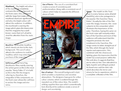
Film Front Cover Analysis 1


Film Front Cover Analysis 2


Film Front Cover Analysis 3 


Tuesday 17 September 2013

Film Website Research


 Insidious Chapter 2 http://www.insidiousch2.com/#/home  


Website Analysis

The initial design of the website is quite simplistic but highly interactive and the display is integrated with the film. This integration contributes to the overall professional finish. For example, the iconic, vibrant doors are featured within the  and so the audience will soon recognise these icons as a symbol of the franchise; which will strengthen their marketing campaign. In addition, these distinguishable icons will help to create different styles of posters that may act as a teaser for the audience. The background is completely black, with a small source of light perched in front. Most websites have a white background and so, this website is unusual and instantly impacting. The wall of darkness behind the doors dominates the page, this, combined with the animated smoke a t the bottom, implies that the genre of the film is horror.
 As a result, the display of the website tells the audience the genre of the film and the kind of mood it portrays. At the top the website, there is a bright red banner which stands out against the dark, eerie background where the audience can purchase tickets instantly from a different site. Therefore, the website itself acts as a direct selling tool. The interactive doors are a clever way of showing more information and keeping the thrilling atmosphere. The interactions within these doors are entertaining and enticing; which influences purchases. The franchise has also intergrated with social media websites, this is essentially marketing by the public. The bottom right of the page features a transition of tweets about the new film, the website is encouraging people to 'join the conservation' and talk about the film on twitter. Also, the top left features other social media websites where fans can gain more info or share this website. The social media input on the website creates a new stream of advertisement.


Welcome

Hello, this is my blog for my A2 Media Production - Playing Judas. I will post all tasks that has contributed to the production, including: Research and Planning, Audience Research and the final Film Poster and Magazine (including drafting).